
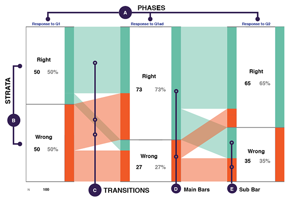
iSAT is an interactive visual representation to highlight transitions in a dataset. The structure of the diagram is illustrated in the Figure 1.
While visualizing in iSAT each attribute of the dataset is considered as a Phase and represented by a column (element A in Fig.1).
In each Phase based on criteria set on attribute values, Strata represent pre-defined categories (B in Fig.1). Each Stratum indicates a cohort with in a Phase and is represented as a colored bar on the right edge of the column (D in Fig). The height of the bar encodes its proportion in that Phase (total height = 100% of data).
Transitions are the links that trace migration of the cohort across Phases (C in Fig.1). The stacked bars on the left of the column represent the proportion of the Stratum that is migrating from the previous phase (E in Fig.1). For a given Stratum each bar on the left has the representative color of the stratum of the previous phase and height proportional to the number of records that is migrating to the current stratum.
Clicking on Stratum or Transition highlights where that specific cohort migrates across the different Phases of the diagram
Researchers have used iSAT to explicate patterns in their data and interpreted from the perspective of their research context.
Mainly iSAT helped in analysing transition patterns across time or attributes.

exploring temporal transition patterns of a collected data attribute

exploring patterns across multiple attributes in collected data